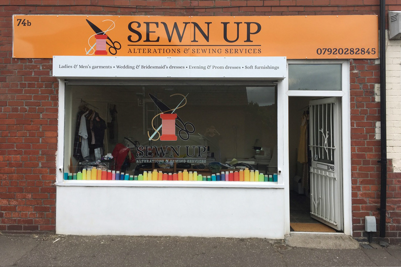
Client: Sewn Up
Project: Brand identity, advertising, promotion
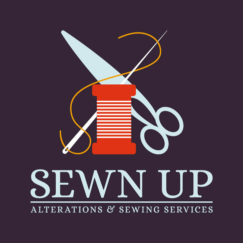
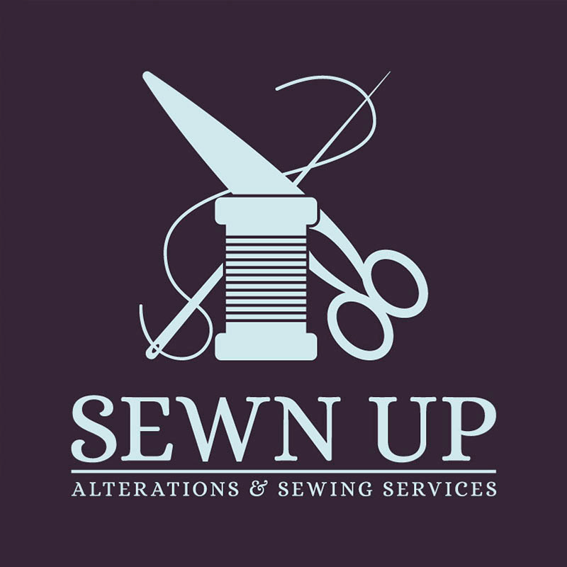
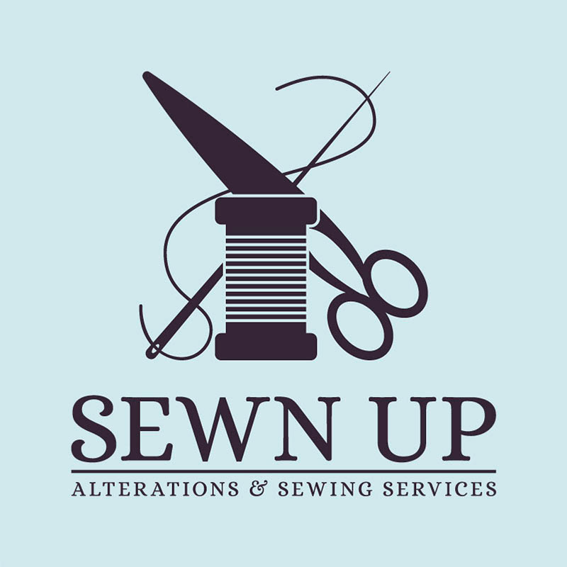
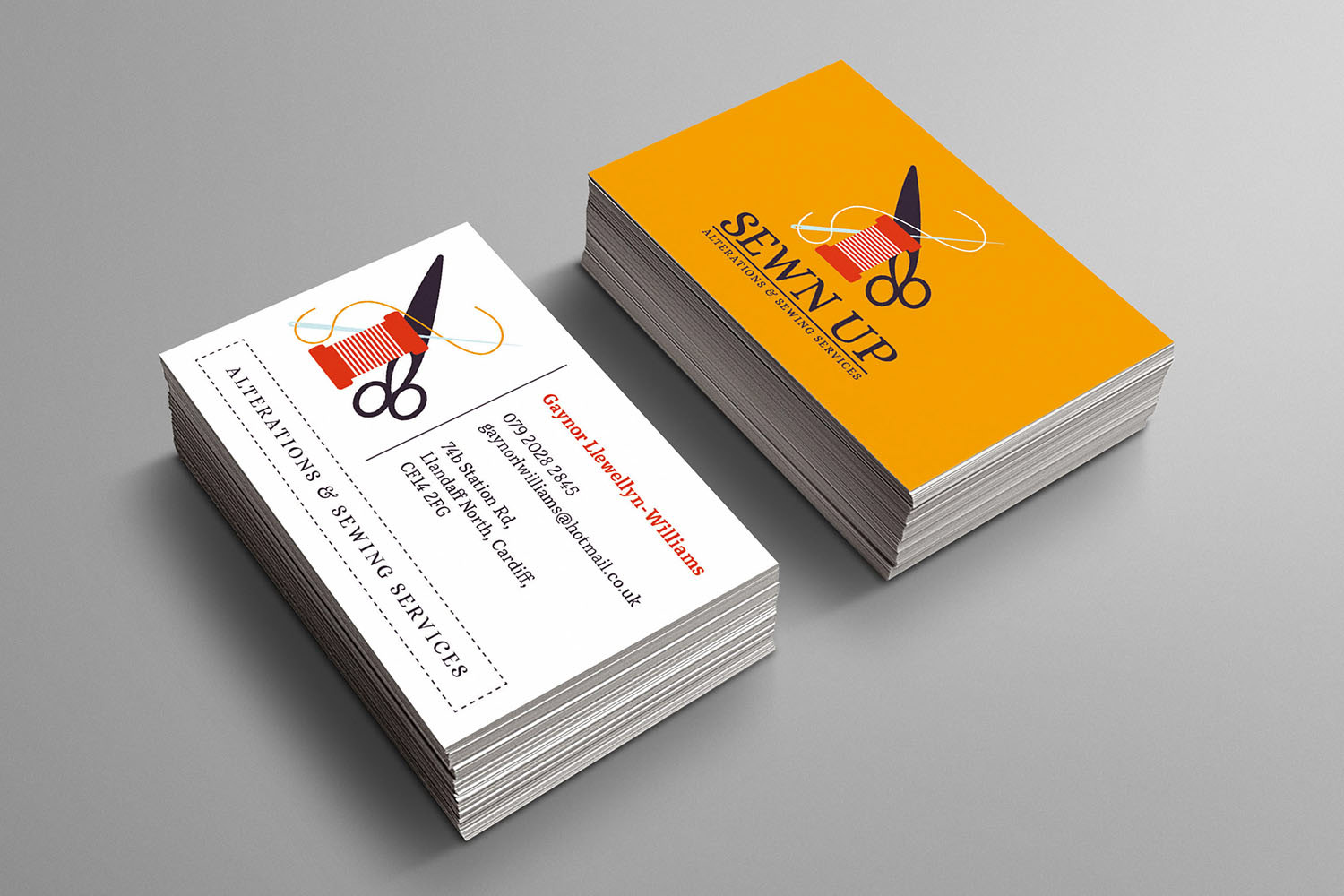
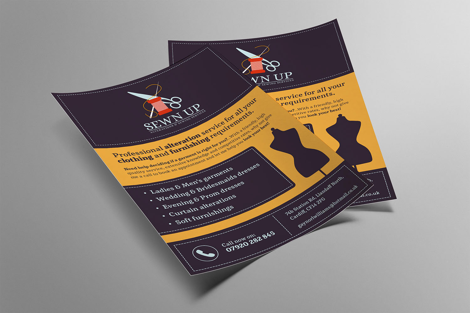
A local sewing and alteration company sought my assistance in creating their brand identity. I avoided the clichés of script typefaces, hand drawn icons & pastel colours often seen in logos within this industry, and instead opted to include lively colours & geometric shapes combined with a strong serif typeface to add a modern voice to a traditional craft. The vibrancy of the colours and illustrative brand mark helped the business to stand out in a busy retail environment resulting in a 200% increase in footfall within their first month of advertising & rebranding their storefront.
Primary Logo
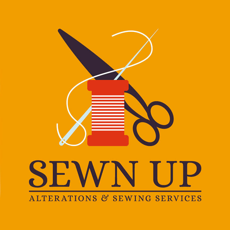
Secondary Logo
Business Cards

Promotional Flyers
Store-Front Mockup

Final Store-Front